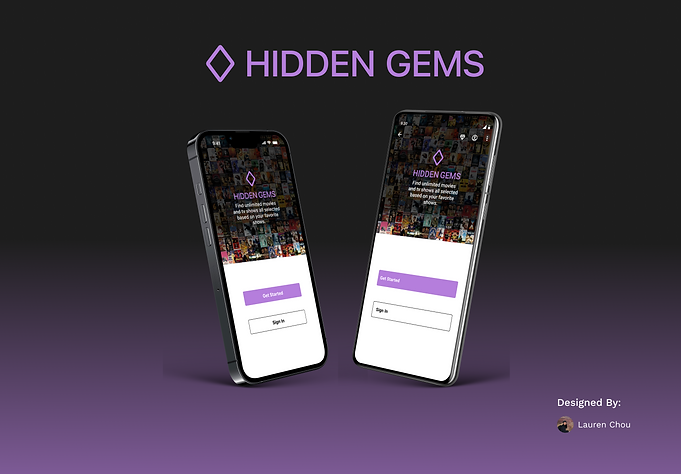
HIDDEN GEMS
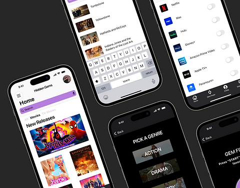
This movie-finder application improves user experience by incorporating features that make finding tv shows & movies much easier & more time efficient.
TIMELINE
July - August 2023
ROLE
Product designer and researcher
SKILLS
User research, customer journey mapping, wireframing, branding, prototyping, user testing
01
02
THE PROBLEM
THE SOLUTION
Numerous choices but aimlessly scrolling through all the streaming services or tv stations resulting in wasting down time.
Streamline the process by integrating features that allow users to input the streaming services they already have, "gem finder" that allows you to answer a few questions and provides you with suggestions.
COMPETITOR ANALYSIS
The common movie-finder app has quality features but there is not a single application that contains all the features in order to make the search for a show seamless.

Reelgood is a common movie/tv show-finder application that has features like

JustWatch is another popular show finder application that i used as a reference when creating hidden gems
ROULETTE THAT HELPS YOU FIND SHOWS
HEAVILY ENCOURAGES YOU TO MAKE AN ACCOUNT WHILE NAVIGATING
SUGGESTS SHOWS BUT DOES NOT ALLOW YOU SPECIFY WHAT GENRE RESULTING IN AN AIMLESS SEARCH
SHOWS SHOWS BASED ON STREAMING SERVICES
NOT A LOT OF INFORMATION REGARDING THE CONTENT OF THE SHOW
USER INTERVIEWS
"AS SOMEONE WHO LOVES WATCHING NEW SHOWS,
IT IS HARD TO FIND SHOWS THAT PEAK MY INTEREST AND A LOT OF TIMES I END UP SPENDING MORE TIME SEARCHING THAN WATCHING"
FINDINGS
Through in-depth user interviews, i gained insight into users' first-hand experiences with the design process review process. these insights confirmed the data collected from the competitor analysis and led to revealing a clear opportunity for improvement
JENNY
Coder & iOS user
FEEDBACK:
-
Not much need for a profile might want to think about taking it out
-
Color palette is hard on the eyes
ALEX
Designer & Android user
FEEDBACK:
-
Red as the secondary color might not be the best idea. Whatever it is surrounding makes it look like the most important thing on the page
INSIGHT:
-
Profile page is viewed as insignificant by numerous users, remove that screen
-
Color palette needs to be updated and be more muted colors
-
Include more information and more visuals for screens
MEREDITH
iOS user
FEEDBACK:
-
Background for the gem finder feature seems bare
-
Add more information to gem finder page
MVP
To make sure the interface functions properly objectives and requirements were determined
OBJECTIVE
-
Allow users to find shows based on their streaming services
-
Assist in finding shows based on user preferences
-
Make finding a show more time efficient
HYPOTHESIS
-
Users are looking for a simpler solution to finding a new good show to watch
FEATURED REQUIREMENTS
-
The user should have a subscription filter
-
Feature that allows user to answer questions and receive suggestions
.png)
USER FLOWS
DEFINING THE USER'S PATH
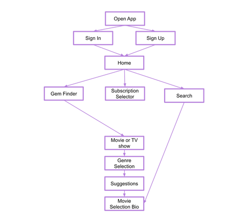
After identifying problems and refining the MVP goals, I made a user flow to visualize the tasks the user would go through.
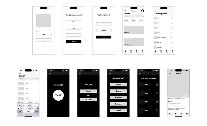
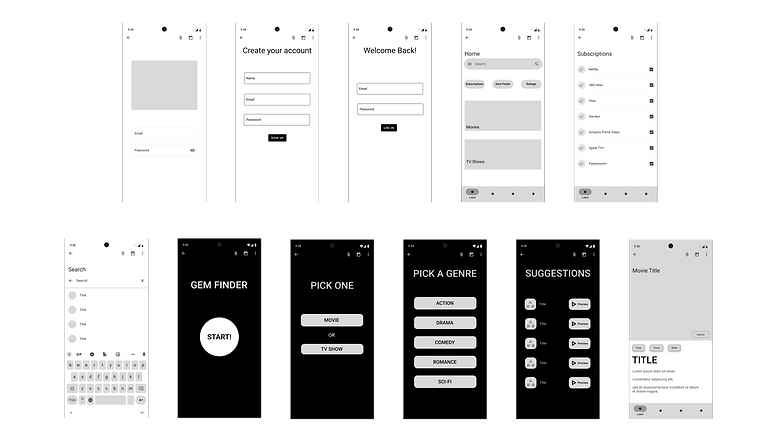
LOW-FIDELITY APPLE & ANDROID WIREFRAMES
By starting with basic designs and gradually making them more detailed, I was able to evaluate their effectiveness and consolidate the design process into one main hub.
BRANDING
-
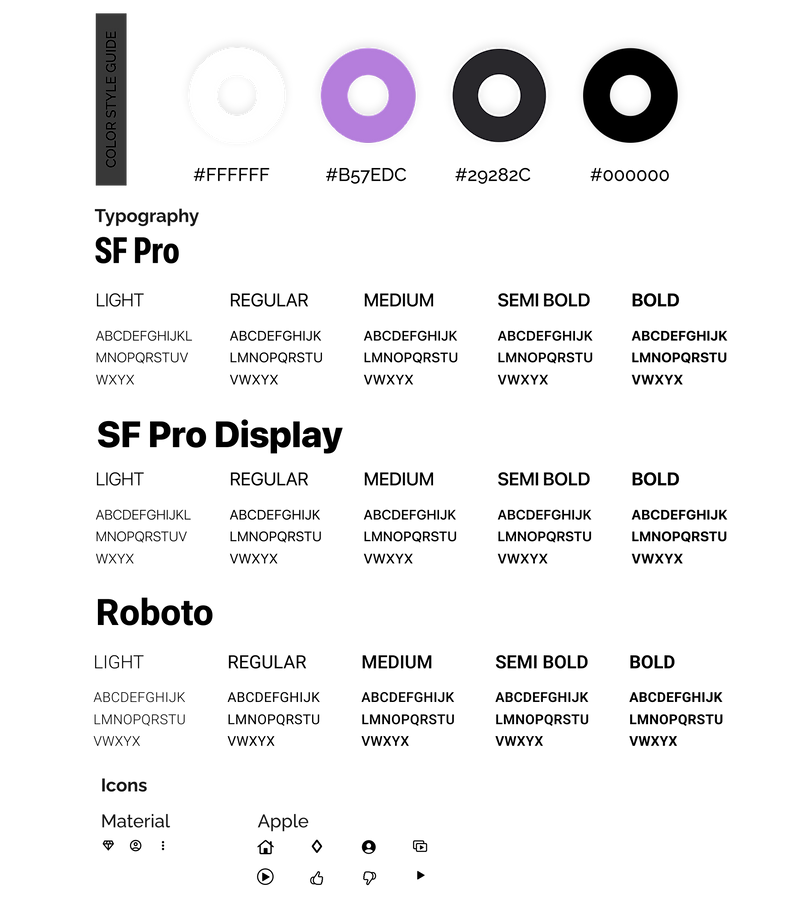
When determining the color palette for EZ Eating, I wanted the colors to be simple in order to let the show art be the main eye catcher
-
The typography was chosen to based on iOS and material guidelines
-
The logo was designed to incorporate visual representation of a "gem"
HIGH-FIDELITY APPLE AND ANDROID WIREFRAMES
After user testing and receiving feedback from other designers I was able to make adjustments and finalize my high-fidelity wireframes.
TESTING
I conducted a usability test with users of all ages and backgrounds.
RESULTS
AVERAGE OVERALL APP RATING ON
A SCALE OF 1-10:
8.5
COMPLETION RATE OF GIVEN TASKS:
94%
KEY ADJUSTMENTS
-
Removal of profile
-
Make screens of gem finder more visually pleasing
THE PROBLEM
Numerous choices but aimlessly scrolling through all the streaming services or tv stations resulting in wasting down time
THE SOLUTION
Hidden Gems streamlines the process by integrating features that allow users to input the streaming services they already have, "gem finder" that allows you to answer a few questions and provides you with suggestions.


-1.png)
