SILVER SAVER
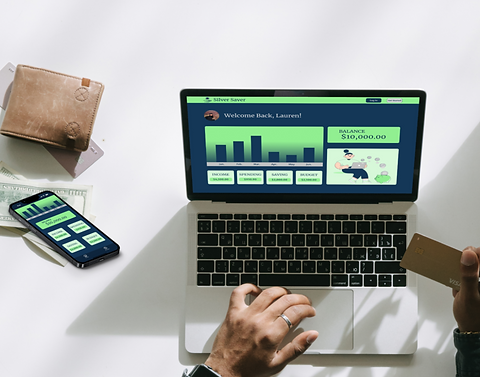
This mobile based application optimized user experience by integrating functionalities that help users feel more confident in the intimidating subject of finances.
TIMELINE
October 2023
ROLE
Product designer & researcher
SKILLS
User research, customer journey mapping, wireframing, branding, prototyping, user testing

01
02
THE PROBLEM
THE SOLUTION
Overwhelming subject that younger people are intimidated by, not enough information or explanations.
Improve the process by integrating features that allow users to feel more informed, comfortable and safe with their own money.

"SAVING MONEY CAN BE REALLY HARD WHEN YOU'RE JUST STARTING OUT. IT'S NOT SOMETHING THEY TEACH YOU A LOT ABOUT IN SCHOOL."
MVP
To make sure the interface functions properly objectives and requirements were determined.
OBJECTIVE
-
Create a budget to help with money saving goals
-
Make saving money feel easy
-
The user feel very informed and confident
HYPOTHESIS
-
Users are looking for a better way to understand finances
-
The learning curve is daunting because it can affect your way of living
FEATURED REQUIREMENTS
-
Bank account input to help you create a budget
-
Visuals to show you are successful in saving or where you need to improve

USER FLOWS
DEFINING THE USER'S PATH
After identifying problems and refining the MVP goals, I made a user flow to visualize the tasks the user would go through.
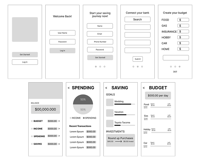
LOW-FIDELITY & MID-FIDELITY WIREFRAMES
By starting with basic designs and gradually making them more detailed, I was able to evaluate their effectiveness and consolidate the design process into one main hub.


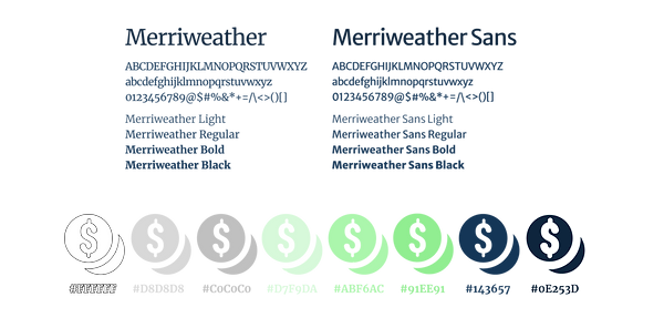
BRANDING
-
WHEN DETERMINING THE COLOR PALETTE FOR SILVER SAVER WAS CHOSEN TO REFLECT THE COLOR MOST USERS THINK OF WHEN THINKING OF MONEY, GREEN. SHADES OF SILVER WERE INCORPORATED AS WELL TO REPRESENT COINS.
-
THE TYPOGRAPHY WAS CHOSEN TO GIVE A FEELING OF MATURITY AND SIMPLICITY
-
THE LOGO FOCUSES ON COINS
-
US DIMES, QUARTERS, HALF DOLLARS AND DOLLARS WERE MINTED IN 90% SILVER
-


TESTING
I conducted a usability test with users of all ages and backgrounds.
RESULTS
AVERAGE OVERALL APP RATING ON
A SCALE OF 1-10:
9
COMPLETION RATE OF GIVEN TASKS:
98%
KEY ADJUSTMENTS
-
Make a few cosmetic changes to improve the look and feel of the app
-
Enlarge click area
-
Users are having to be very precise when clicking on the smaller areas
-
HIGH-FIDELITY WIREFRAMES
After user testing and receiving feedback from other designers I was able to make adjustments and finalize my high-fidelity wireframes.
THE PROBLEM
Overwhelming subject that younger people are intimidated by, not enough information or explanations.
THE SOLUTION
Silver Saver improves the process by integrating features that allow users to feel more informed, comfortable and safer with their own money.


